In May of this year, Google officially announced the new Android N system at the I/O Developer Conference. A month later, Apple also held its own WWDC Global Developer Conference as usual, and officially launched the iOS 10 operating system. Today, Google’s Android N has released the last preview system, and Apple’s iOS 10 page has entered the Beta 2 link, both of which have been stable, and we’ve also put the phone into our hands for the first time. The latest system, let's take a simple comparison, and see how much difference Android and iOS have been after years of competition.
Past and Present
Android is a free and open-source operating system based on Linux. It is mainly used on mobile devices such as smart phones and tablets. It is led and developed by Google and Open Mobile Alliance. The first Android smart phone was released in October 2008.

OS is a mobile operating system developed by Apple. Apple first announced the system at the Macworld conference on January 9, 2007. It was originally designed for use on the iPhone, and later applied to iPod touch, iPad, and Apple TV. iOS, like Apple's Mac OS X operating system, is a Unix-like commercial operating system. Originally this system was named iPhone OS, because iPad, iPhone, iPod touch all use iPhone OS, so announced at the 2010WWDC conference changed its name to iOS.

Android and iOS are now basically the operating systems of all smart mobile devices (Windows Phone system share is extremely low). Wide range of mobile phones, tablets, smart watches and other fields. And gradually build their own ecological chain. For example, if the home is a smart hardware device of the Apple system, the file transfer between the hardware will become seamless and efficient. Users can use it to control other system devices.
First sight
This time we used to brush into the preview version of the system are Google's "parents", Nexus 6P mobile phones produced by Huawei OEM and the author's personal use of the iPhone6s. The system version is Android N Beta5 preview and iOS 10 Beta2 beta preview.
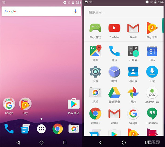
Let's take a look at the Android system. After we set up the system for booting, we enter the initial interface of Android N. At first glance, this interface style is really "very Google." At the top of the screen is the search bar; down is the Google Apps folder, Play folder, and Play Store; the system tray location is still familiar with the "Four Diamonds" and drawer buttons. After entering the "drawer", I saw all the original Google family buckets. However, for the design of this icon, Google still maintains the Material Design design element since Android 5.0. The rich color design of "artifact + flat" is the author's personal Icon rating for Android N. Although the style of icons does not seem uniform, it must be said that such a bright color design does give people a feeling of continued freshness.
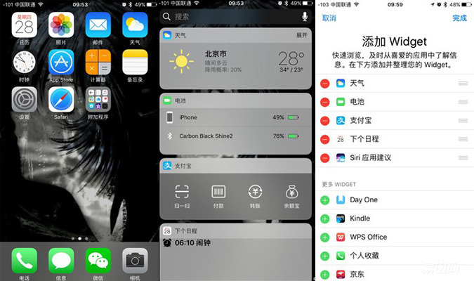
Let's take a look at iOS. The rounded rectangle design style that the iOS system inherited from the first generation of iPhone has been learned and learned by many manufacturers. Starting from the iOS 7 system, Apple has changed the overall style, from the original iconification style icon to a flat design style. The overall color is also brighter and brighter than before. The iOS system has always had only one layer of desktop menus. All the icons are displayed on the desktop with rounded rectangles, which presents a neat and clean visual experience.
Style experience
Lock screen interface
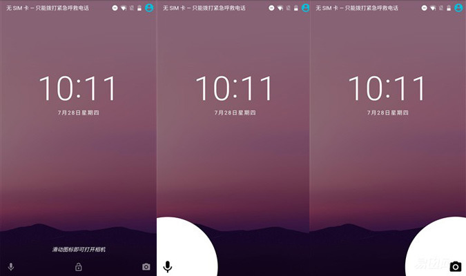
In the lock screen interface, Android N's style and the original Android M have not changed much, and the screen center still displays the time and date. At the bottom is the left-to-right voice assistant, unlock, and the camera's quick entry. When there is a new message, the prompt prompt content of the message is displayed in the center of the lock screen, and the user can also enter the notification bar to view the message by pulling down from the top of the screen.
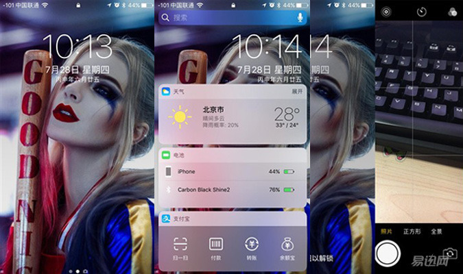
The biggest change for iOS 10 in the lock screen interface is that the "slide to the right to unlock" from the iOS generation has disappeared and replaced by the words "press the home screen button to unlock". However, users who have already entered fingerprints still need to press the home button to unlock. Sliding to the right of the lock screen interface is a new interface, which is integrated into Apple's Spotlight and widget plug-in center. Swiping to the left is a quick access to the camera interface. This icon, which was originally in the lower right corner of the lock screen, was finally changed to another shortcut, but it was also complained by many users that there was an "Android shadow."
Message notification, control center
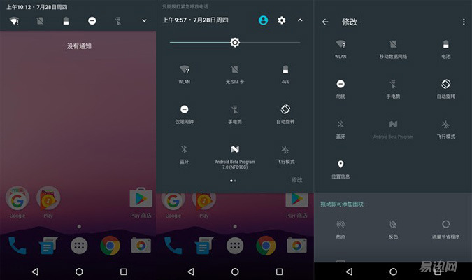
The Android message notification bar was originally designed to pull out from the top of the screen. On Android N, the notification bar icon followed the Material Design design and became a flat style. After the drop-down, we found that the display of the time and date was uniformly placed on the top, and at the same time can accommodate more icon switches. If you want to enter the complete notification bar, you need to pull down the second time, the first line is arranged with time and date, user buttons and settings buttons. Below is the brightness adjustment and the small switch, the overall design is more compact, but also fully reflects the Android N's "efficiency first" definition.
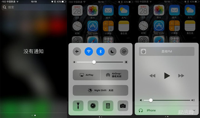
In contrast, on iOS 10, the notification bar has undergone a new design change. Instead of the previous iOS system, the notification bar is divided into two areas, the simple "information" and "widget plug-in." And the widget's plug-in graphic style was re-planned. As a control center of iOS, a new change has also been made on iOS 10, changing from the original page function to two pages. Although no functionality has been added, icon boxes like Airpaly and Airdrop have become larger and more easily identifiable, which may also be to prepare for future screen interconnections with other OS platforms. Naturally, the second page is the most frequently used music switch and volume adjustment.
Multi-tasking bar
In the multi-task bar style selection, both companies have chosen to present their cards in a card-like manner. Only Android is vertically arranged, while Apple is horizontally arranged. However, on multitasking, Android has a feature that Apple does not have, which is "all clear." Do not think that this function is inconspicuous. When we open a lot of tasks and we're tired of finishing tasks one by one, this function will be of great use.
Some friends may say this is because the memory mechanisms of the two systems are not the same. There is indeed such a reason inside. Apple's "tombstone mechanism" can freeze background applications, leaving only front-end running applications to maximize the use of mobile phone memory. This is why Apple's mobile phones have been slow to evolve over the years. And Android is the background open-ended, how much use, it also caused a lot of users say "more use more cards", in fact, this is the complexity of the memory channel has been squeezed too much, you need to clear all the tasks to release the memory. But leaving the memory problem aside, and from the point of view of use, it is a matter of how physically and mentally clear it is to clear it all at once.
Lynx Box M13
Installation Guide>>
Huawei Glory Box Pro
Installation Guide>>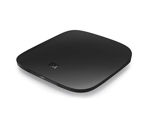
Millet box 3
Installation Guide>>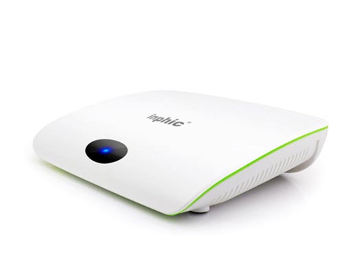
Infinik i9
Installation Guide>>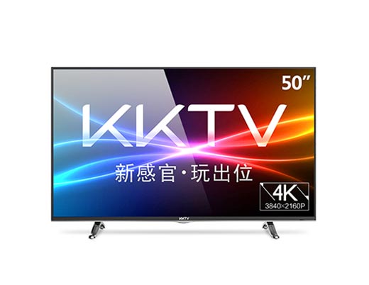
KKTV
Installation Guide>>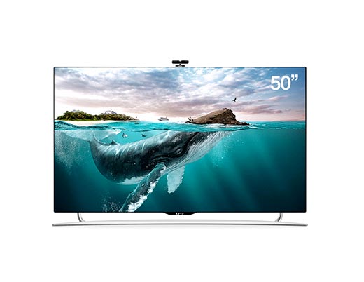
Letv TV S50 Air
Installation Guide>> Many new features! Recently the intelligent sweeper new inventory 51 sweep recommended the first vibration tank design VR series horror movie came to ask you afraid of smart speakers new products, Tencent is really a novice: Tencent listen to 9420 smart speakers unpacking first experience the site the first sun Meizu Is Meizu 15 your dream machine?
  Canon EOS M6 Camera Start Experience TITAN X Star Wars Collector's Edition Released Even AMD's Red has taken from Getting Started to Abandon: Synology Synology DS416play NAS Network Storage Usage Report (on) Black Group DSM 6.1 Installation Concise Tutorial (with download ) A bumpy upgrade path - the use of NETGEAR R6400 hand brushing Merlin firmware

